Here is a collection of short tutorials, examples and code snippets that illustrate some of the useful idioms and tricks to make snazzier figures and overcome some matplotlib warts.
It’s common to make two or more plots which share an axis, eg two subplots with time as a common axis. When you pan and zoom around on one, you want the other to move around with you. To facilitate this, matplotlib Axes support a sharex and sharey attribute. When you create a subplot() or axes() instance, you can pass in a keyword indicating what axes you want to share with
In [96]: t = np.arange(0, 10, 0.01)

In [97]: ax1 = plt.subplot(211)

In [98]: ax1.plot(t, np.sin(2*np.pi*t))
Out[98]: [<matplotlib.lines.Line2D object at 0x98719ec>]

In [99]: ax2 = plt.subplot(212, sharex=ax1)

In [100]: ax2.plot(t, np.sin(4*np.pi*t))
Out[100]: [<matplotlib.lines.Line2D object at 0xb7d8fec>]
In early versions of matplotlib, if you wanted to use the pythonic API and create a figure instance and from that create a grid of subplots, possibly with shared axes, it involved a fair amount of boilerplate code. e.g.
# old style
fig = plt.figure()
ax1 = fig.add_subplot(221)
ax2 = fig.add_subplot(222, sharex=ax1, sharey=ax1)
ax3 = fig.add_subplot(223, sharex=ax1, sharey=ax1)
ax3 = fig.add_subplot(224, sharex=ax1, sharey=ax1)
Fernando Perez has provided a nice top level method to create in subplots() (note the “s” at the end) everything at once, and turn off x and y sharing for the whole bunch. You can either unpack the axes individually:
# new style method 1; unpack the axes
fig, ((ax1, ax2), (ax3, ax4)) = plt.subplots(2, 2, sharex=True, sharey=True)
ax1.plot(x)
or get them back as a numrows x numcolumns object array which supports numpy indexing:
# new style method 2; use an axes array
fig, axs = plt.subplots(2, 2, sharex=True, sharey=True)
axs[0,0].plot(x)
matplotlib allows you to natively plots python datetime instances, and for the most part does a good job picking tick locations and string formats. There are a couple of things it does not handle so gracefully, and here are some tricks to help you work around them. We’ll load up some sample date data which contains datetime.date objects in a numpy record array:
In [63]: datafile = cbook.get_sample_data('goog.npy')

In [64]: r = np.load(datafile).view(np.recarray)

In [65]: r.dtype
Out[65]: dtype([('date', '|O4'), ('', '|V4'), ('open', '<f8'),
                ('high', '<f8'), ('low', '<f8'), ('close', '<f8'),
                ('volume', '<i8'),  ('adj_close', '<f8')])

In [66]: r.date
Out[66]:
array([2004-08-19, 2004-08-20, 2004-08-23, ..., 2008-10-10, 2008-10-13,
       2008-10-14], dtype=object)
The dtype of the numpy record array for the field date is |O4 which means it is a 4-byte python object pointer; in this case the objects are datetime.date instances, which we can see when we print some samples in the ipython terminal window.
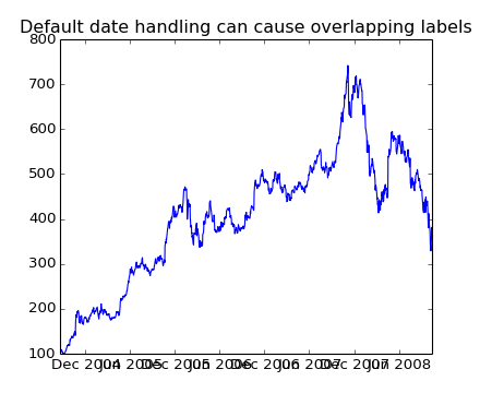
If you plot the data,
In [67]: plot(r.date, r.close)
Out[67]: [<matplotlib.lines.Line2D object at 0x92a6b6c>]
you will see that the x tick labels are all squashed together.
(Source code, png)
Another annoyance is that if you hover the mouse over a the window and look in the lower right corner of the matplotlib toolbar (Interactive navigation) at the x and y coordinates, you see that the x locations are formatted the same way the tick labels are, eg “Dec 2004”. What we’d like is for the location in the toolbar to have a higher degree of precision, eg giving us the exact date out mouse is hovering over. To fix the first problem, we can use matplotlib.figure.Figure.autofmt_xdate() and to fix the second problem we can use the ax.fmt_xdata attribute which can be set to any function that takes a scalar and returns a string. matplotlib has a number of date formatters built in, so we’ll use one of those.
plt.close('all')
fig, ax = plt.subplots(1)
ax.plot(r.date, r.close)

# rotate and align the tick labels so they look better
fig.autofmt_xdate()

# use a more precise date string for the x axis locations in the
# toolbar
import matplotlib.dates as mdates
ax.fmt_xdata = mdates.DateFormatter('%Y-%m-%d')
plt.title('fig.autofmt_xdate fixes the labels')
(Source code, png)
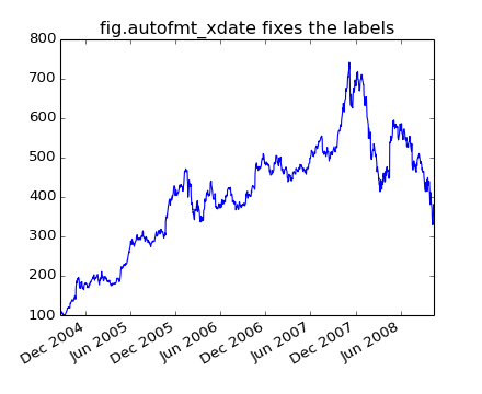
Now when you hover your mouse over the plotted data, you’ll see date format strings like 2004-12-01 in the toolbar.
The fill_between() function generates a shaded region between a min and max boundary that is useful for illustrating ranges. It has a very handy where argument to combine filling with logical ranges, eg to just fill in a curve over some threshold value.
At its most basic level, fill_between can be use to enhance a graphs visual appearance. Let’s compare two graphs of a financial times with a simple line plot on the left and a filled line on the right.
import matplotlib.pyplot as plt
import numpy as np

import matplotlib.cbook as cbook

# load up some sample financial data
datafile = cbook.get_sample_data('goog.npy')
r = np.load(datafile).view(np.recarray)

# create two subplots with the shared x and y axes
fig, (ax1, ax2) = plt.subplots(1,2, sharex=True, sharey=True)

pricemin = r.close.min()

ax1.plot(r.date, r.close, lw=2)
ax2.fill_between(r.date, pricemin, r.close, facecolor='blue', alpha=0.5)

for ax in ax1, ax2:
    ax.grid(True)

ax1.set_ylabel('price')
for label in ax2.get_yticklabels():
    label.set_visible(False)

fig.suptitle('Google (GOOG) daily closing price')
fig.autofmt_xdate()
(Source code, png)
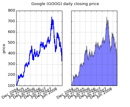
The alpha channel is not necessary here, but it can be used to soften colors for more visually appealing plots. In other examples, as we’ll see below, the alpha channel is functionally useful as the shaded regions can overlap and alpha allows you to see both. Note that the postscript format does not support alpha (this is a postscript limitation, not a matplotlib limitation), so when using alpha save your figures in PNG, PDF or SVG.
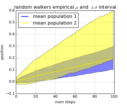
Our next example computes two populations of random walkers with a different mean and standard deviation of the normal distributions from which the steps are drawn. We use shared regions to plot +/- one standard deviation of the mean position of the population. Here the alpha channel is useful, not just aesthetic.
import matplotlib.pyplot as plt
import numpy as np

Nsteps, Nwalkers = 100, 250
t = np.arange(Nsteps)

# an (Nsteps x Nwalkers) array of random walk steps
S1 = 0.002 + 0.01*np.random.randn(Nsteps, Nwalkers)
S2 = 0.004 + 0.02*np.random.randn(Nsteps, Nwalkers)

# an (Nsteps x Nwalkers) array of random walker positions
X1 = S1.cumsum(axis=0)
X2 = S2.cumsum(axis=0)


# Nsteps length arrays empirical means and standard deviations of both
# populations over time
mu1 = X1.mean(axis=1)
sigma1 = X1.std(axis=1)
mu2 = X2.mean(axis=1)
sigma2 = X2.std(axis=1)

# plot it!
fig, ax = plt.subplots(1)
ax.plot(t, mu1, lw=2, label='mean population 1', color='blue')
ax.plot(t, mu1, lw=2, label='mean population 2', color='yellow')
ax.fill_between(t, mu1+sigma1, mu1-sigma1, facecolor='blue', alpha=0.5)
ax.fill_between(t, mu2+sigma2, mu2-sigma2, facecolor='yellow', alpha=0.5)
ax.set_title('random walkers empirical $\mu$ and $\pm \sigma$ interval')
ax.legend(loc='upper left')
ax.set_xlabel('num steps')
ax.set_ylabel('position')
ax.grid()
(Source code, png)

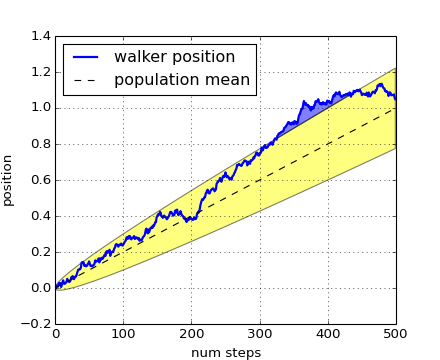
The where keyword argument is very handy for highlighting certain regions of the graph. where takes a boolean mask the same length as the x, ymin and ymax arguments, and only fills in the region where the boolean mask is True. In the example below, we simulate a single random walker and compute the analytic mean and standard deviation of the population positions. The population mean is shown as the black dashed line, and the plus/minus one sigma deviation from the mean is shown as the yellow filled region. We use the where mask X>upper_bound to find the region where the walker is above the one sigma boundary, and shade that region blue.
np.random.seed(1234)

Nsteps = 500
t = np.arange(Nsteps)

mu = 0.002
sigma = 0.01

# the steps and position
S = mu + sigma*np.random.randn(Nsteps)
X = S.cumsum()

# the 1 sigma upper and lower analytic population bounds
lower_bound = mu*t - sigma*np.sqrt(t)
upper_bound = mu*t + sigma*np.sqrt(t)

fig, ax = plt.subplots(1)
ax.plot(t, X, lw=2, label='walker position', color='blue')
ax.plot(t, mu*t, lw=1, label='population mean', color='black', ls='--')
ax.fill_between(t, lower_bound, upper_bound, facecolor='yellow', alpha=0.5,
                label='1 sigma range')
ax.legend(loc='upper left')

# here we use the where argument to only fill the region where the
# walker is above the population 1 sigma boundary
ax.fill_between(t, upper_bound, X, where=X>upper_bound, facecolor='blue', alpha=0.5)
ax.set_xlabel('num steps')
ax.set_ylabel('position')
ax.grid()
(Source code, png)
Another handy use of filled regions is to highlight horizontal or vertical spans of an axes – for that matplotlib has some helper functions axhspan() and axvspan() and example pylab_examples example code: axhspan_demo.py.
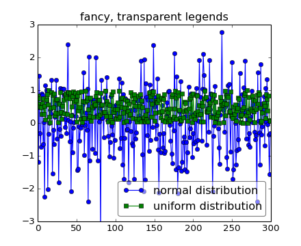
Sometimes you know what your data looks like before you plot it, and may know for instance that there won’t be much data in the upper right hand corner. Then you can safely create a legend that doesn’t overlay your data:
ax.legend(loc='upper right')
Other times you don’t know where your data is, and loc=’best’ will try and place the legend:
ax.legend(loc='best')
but still, your legend may overlap your data, and in these cases it’s nice to make the legend frame transparent.
np.random.seed(1234)
fig, ax = plt.subplots(1)
ax.plot(np.random.randn(300), 'o-', label='normal distribution')
ax.plot(np.random.rand(300), 's-', label='uniform distribution')
ax.set_ylim(-3, 3)
leg = ax.legend(loc='best', fancybox=True)
leg.get_frame().set_alpha(0.5)

ax.set_title('fancy, transparent legends')
(Source code, png)
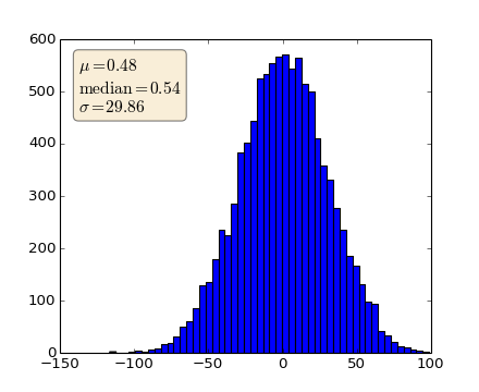
When decorating axes with text boxes, two useful tricks are to place the text in axes coordinates (see Transformations Tutorial), so the text doesn’t move around with changes in x or y limits. You can also use the bbox property of text to surround the text with a Patch instance – the bbox keyword argument takes a dictionary with keys that are Patch properties.
np.random.seed(1234)
fig, ax = plt.subplots(1)
x = 30*np.random.randn(10000)
mu = x.mean()
median = np.median(x)
sigma = x.std()
textstr = '$\mu=%.2f$\n$\mathrm{median}=%.2f$\n$\sigma=%.2f$'%(mu, median, sigma)

ax.hist(x, 50)
# these are matplotlib.patch.Patch properties
props = dict(boxstyle='round', facecolor='wheat', alpha=0.5)

# place a text box in upper left in axes coords
ax.text(0.05, 0.95, textstr, transform=ax.transAxes, fontsize=14,
        verticalalignment='top', bbox=props)
(Source code, png)

