Navigation
- index
- modules |

- Python »
- 3.6.1 Documentation »
- |
ui — Native GUI for iOS¶The ui module provides components for building “native” graphical user interfaces on iOS. It is modeled closely after Apple’s UIKit, but it is by no means a complete wrapper, and simplifies some aspects of the framework.
The module is complemented by an integrated UI design tool that can be used to arrange and configure GUI elements without writing any code.
Let’s start with a simple example. The following code just shows a button that says ‘Tap me!’. When you tap on it, it changes its title to ‘Hello!’.
Though it isn’t very useful, this example demonstrates several core concepts of the ui module – basic view layout, presenting a view on screen, and handling events.
import ui

def button_tapped(sender):
    sender.title = 'Hello'

view = ui.View()                                      # [1]
view.name = 'Demo'                                    # [2]
view.background_color = 'white'                       # [3]
button = ui.Button(title='Tap me!')                   # [4]
button.center = (view.width * 0.5, view.height * 0.5) # [5]
button.flex = 'LRTB'                                  # [6]
button.action = button_tapped                         # [7]
view.add_subview(button)                              # [8]
view.present('sheet')                                 # [9]
Let’s look at the code in more detail:
View. This is the base class for pretty much everything that you can put on the screen. A vanilla View is just a colored rectangle, but it can also serve as a container for other views (in this case, a button).'white'. You can use strings (color names and hex), tuples (e.g. (1.0, 0.0, 0.0) for red, (0.0, 1.0, 0.0, 0.5) for half-transparent green), or numbers (e.g. 0.5 for 50% gray). Internally, all these color representations are converted to 4-tuples (r, g, b, a), so when you access the view’s background_color attribute later, you’ll get (1.0, 1.0, 1.0, 1.0), no matter if you set it to 'white', '#ffffff', or just 1.0.Button, setting its title with a keyword argument. When you set a title during initialization, its size is automatically adjusted to fit.View.center attribute, we set the button’s position relative to its parent. In this case, we use half of the parent’s View.width and View.height attributes to center the button.View.flex attribute that controls its auto-resizing behavior. In this case, we want the left, right, top, and bottom margins to be flexible, so that the button stays centered in its container.Button.action attribute to the function that is defined at the top of the script. The function must accept a single parameter, which is conventionally named sender. The parameter will be the button that triggered the event, so you can use a single action for multiple buttons, and determine what to do depending on which button caused the event.View.add_subview() method.View.present() method to get the main view on screen. Views can be presented with different styles. On the iPhone, all views are presented in full-screen, but on the iPad, you can choose between 'sheet', 'popover' and 'fullscreen'.If you went through the example above, you might have thought that this is a lot of code to do very basic things. You can significantly reduce the amount of boilerplate code by using the included visual UI editor.
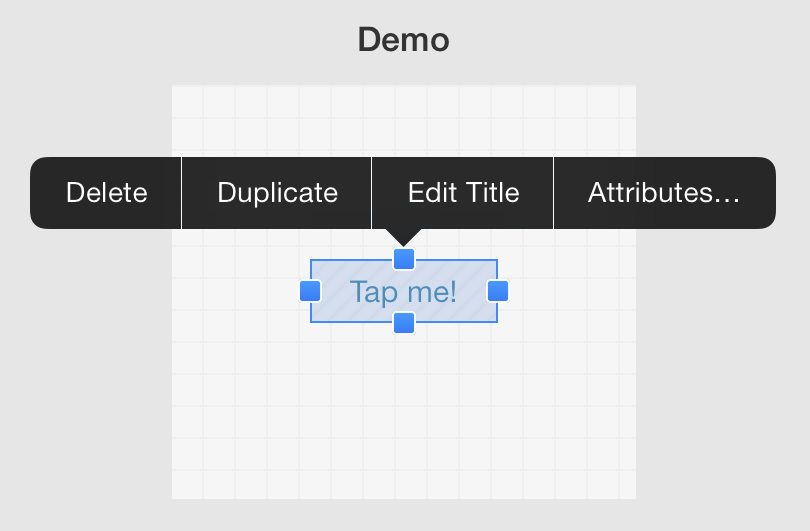
Start by creating a new ‘User Interface’ file in your library. You can then add widgets to the canvas, drag them around, resize them, and configure other parameters with the ‘Attributes...’ inspector.
You can recreate the example above like this:
import ui

def button_tapped(sender):
    sender.title = 'Hello'

ui.load_view('My UI').present('sheet')
This snippet does the exact same thing as the first example, but with a lot less code. The attributes of the button have been set up in the GUI, and all that’s left to do for the code is to load the file using load_view(), and to present the view on screen. The button_tapped action is the same as before, but the connection between the button and the action has also been set up while loading the view.
Note: It is important that the button_tapped function is defined before loading the view because the connection between the button’s action and the function in the code is made during the load_view() call.
Most simple controls, like buttons, sliders, switches, etc. have an action attribute that is responsible for handling the “primary” event of the control. The action of a button is called when the button is tapped, for a slider, it’s called when its value changes, etc.
All actions are functions that take a single parameter, the sender (you can also use a different name if you like), which will always be the control/view that caused the event. You can use this parameter to find out more about the event, e.g. by getting the updated value attribute of a Switch or Slider.
If you’re programming in an object-oriented style, the action can also be a bound method, in this case, the method would of course take two parameters (self and sender).
You can configure a control’s action directly in the UI design tool by entering the function or method name (without parentheses or parameters). If you set the action to a bound method, the name has to begin with self. (methods of other objects are not supported, though you can do this programmatically).
More complex views, like TableView or TextView usually have a delegate attribute. You can think of the delegate as a helper object that the view uses to decide its behavior in certain situations. As an example, a TextView notifies its delegate whenever any text is entered or the selection changes. It also gives the delegate the chance to validate changes, e.g. by rejecting certain characters in a TextView or TextField.
Any object can be a delegate, as long as it implements the methods that are described in the documentation of the individual classes. All delegate methods are optional, for example, if your text view delegate doesn’t implement textview_should_begin_editing, it is assumed that the text view is always allowed to begin editing.
One important thing to keep in mind when implementing actions and delegate methods is that all callbacks are called on the main (UI) thread of the host app. If your function takes a long time to return, the app will appear “frozen” during that time. For delegate methods that are expected to return a value, this is required for the underlying interaction with UIKit. Other callback methods can be decorated to run in the background (on the regular interpreter thread) using @ui.in_background.
In the following callback, console.alert() is used in a button’s action. You cannot do this on the UI thread because console.alert() blocks until you’ve tapped a button in the dialog, so the action is decorated with @ui.in_background:
import ui
import console

@ui.in_background
def button_tapped(sender):
    alert_result = console.alert('Title', 'Message', 'Button 1', 'Button 2')
    sender.title = 'Button ' + str(alert_result)

button = ui.Button(title='Tap me!')
button.action = button_tapped
button.present('sheet')
By subclassing View, you can implement custom touch handling and drawing. View is the only class in the ui module that can be subclassed, and there are a number of methods that custom views can implement to define their behavior and appearance.
It is also possible to add custom views to UIs that are created visually with the UI design tool. Just set the “Custom View Class” attribute in the inspector to the name of your class (this name has to be defined when you load the view).
The example below shows all the methods that a custom view can implement. Note that you don’t necessarily have to implement all of them, e.g. if you don’t have special layout requirements or don’t want to handle touches, you can leave out the layout and touch_... methods.
import ui

class MyView (ui.View):
    def __init__(self):
        # This will also be called without arguments when the view is loaded from a UI file.
        # You don't have to call super. Note that this is called *before* the attributes
        # defined in the UI file are set. Implement `did_load` to customize a view after
        # it's been fully loaded from a UI file.
        pass

    def did_load(self):
        # This will be called when a view has been fully loaded from a UI file.
        pass

    def will_close(self):
        # This will be called when a presented view is about to be dismissed.
        # You might want to save data here.
        pass

    def draw(self):
        # This will be called whenever the view's content needs to be drawn.
        # You can use any of the ui module's drawing functions here to render
        # content into the view's visible rectangle.
        # Do not call this method directly, instead, if you need your view
        # to redraw its content, call set_needs_display().
        # Example:
        path = ui.Path.oval(0, 0, self.width, self.height)
        ui.set_color('red')
        path.fill()
        img = ui.Image.named('ionicons-beaker-256')
        img.draw(0, 0, self.width, self.height)

    def layout(self):
        # This will be called when a view is resized. You should typically set the
        # frames of the view's subviews here, if your layout requirements cannot
        # be fulfilled with the standard auto-resizing (flex) attribute.
        pass

    def touch_began(self, touch):
        # Called when a touch begins.
        pass

    def touch_moved(self, touch):
        # Called when a touch moves.
        pass

    def touch_ended(self, touch):
        # Called when a touch ends.
        pass

    def keyboard_frame_will_change(self, frame):
        # Called when the on-screen keyboard appears/disappears
        # Note: The frame is in screen coordinates.
        pass

    def keyboard_frame_did_change(self, frame):
        # Called when the on-screen keyboard appears/disappears
        # Note: The frame is in screen coordinates.
        pass

v = MyView()
v.present('sheet')
Changes of a lot of View attributes can be animated. For example, you can animate the View.frame attribute to smoothly change its size and position, or View.alpha for fade-in/out animations.
First, you have to write a function that describes the changes you want to apply. This will often be an inner function. Then, you can pass a reference to this function to the animate() function, optionally passing a duration and delay for the animation:
import ui

# The button's action:
def button_tapped(sender):
    def animation():
        sender.alpha = 0.0 # fade out
    ui.animate(animation, duration=1.0)

# Set up and present a view with a single button:
v = ui.View(background_color='white')
button = ui.Button(title='Tap me!')
button.action = button_tapped
v.add_subview(button)
v.present('sheet')
The ui module contains a couple of functions for drawing images, shapes and text. Because they need to know where to draw (in which view, into an image...), you need to have a drawing context set up before you call them.
There are basically two ways of doing that:
draw method (in a custom View subclass), a drawing context has already been set up and all drawing functions will be directed to that view.ImageContext, which is implemented as a context manager. An ImageContext defines the size of the canvas and allows you to access the resulting Image object when you’re done drawing.Here’s an example that draws a red circle on a white background, and then shows the resulting image in the console:
import ui

with ui.ImageContext(100, 100) as ctx:
    ui.set_color('white')
    ui.fill_rect(0, 0, 100, 100)
    ui.set_color('red')
    circle = ui.Path.oval(10, 10, 80, 80)
    circle.fill()
    img = ctx.get_image()
    img.show()
ui.View([frame=(0, 0, 100, 100), flex='', background_color=None, name=None])¶The View class defines a rectangular area on the screen. Views are responsible for rendering their content, and all touch events that occur within their bounds.
All controls, like buttons, text fields, etc. are derived from the View class and inherit all of its attributes and methods, but it’s also possible to create a vanilla View for showing a colored rectangle on screen or to use as a container for other views.
It’s also possible to subclass View to draw custom content or to handle touch events directly (see Building Custom Views for more information about implementing custom views).
Views have a name attribute for identifying them in code (for example, when they’re loaded from a UI file). You can access a view’s direct children (subviews) by name with a dictionary-like syntax, e.g. my_view['subview_name'].
View.alpha¶The view’s alpha value as a float in the range 0.0 to 1.0 (0.0 is fully transparent, 1.0 fully opaque).
View.background_color¶The view’s background color, defaults to None (transparent).
When setting this attribute, you can pass a string (CSS color name or hex, e.g. 'red' or '#ff0000'), a tuple (e.g. (1.0, 0.0, 0.0, 0.5) for half-transparent red), or a number (e.g. 0.5 for 50% gray). Internally, all colors are converted to RGBA tuples, so when you access the color later, you’ll get (1.0, 1.0, 1.0, 1.0), no matter if you set the color to 'white', '#ffffff' or just 1.0.
View.border_color¶The view’s border color (only has an effect if border_width is > 0)
When setting this attribute, you can pass a string (CSS color name or hex, e.g. 'red' or '#ff0000'), a tuple (e.g. (1.0, 0.0, 0.0, 0.5) for half-transparent red), or a number (e.g. 0.5 for 50% gray). Internally, all colors are converted to RGBA tuples, so when you access the color later, you’ll get (1.0, 1.0, 1.0, 1.0), no matter if you set the color to 'white', '#ffffff' or just 1.0.
View.border_width¶The view’s border width, defaults to zero (no border)
View.bounds¶The view’s location and size in its own coordinate system, represented as a 4-tuple (x, y, width, height). x and y will be zero by default, but you can set non-zero values to display different portions of the view. The value is coupled to the frame attribute (changes in one affect the other).
View.center¶The center of the view’s frame as a 2-tuple (x, y).
View.content_mode¶Determines how a view lays out its content when its bounds change. Can be one of the View Content Mode constants listed below. For custom View subclasses, this is set to CONTENT_MODE_REDRAW by default.
View.corner_radius¶The View’s corner radius.
View.flex¶The autoresizing behavior of the view. When a view changes its bounds, it automatically resizes its subviews according to the flags set by this attribute.
The flags are represented as a string of one-letter “codes” that specify how the view should be resized.
Valid flags are “W” (flexible width), “H” (flexible height), “L” (flexible left margin), “R” (flexible right margin), “T” (flexible top margin), “B” (flexible bottom margin).
Examples:
If you don’t want auto-resizing to occur, use an empty string.
View.frame¶The view’s position and size in the coordinate system of its superview (parent). The rectangle is represented as a 4-tuple (x, y, width, height).
View.height¶Shortcut for getting/setting the height component of the view’s frame.
Determines if the view is hidden. Hidden views do not receive any touch events.
A sequence of ButtonItem objects that are shown in the title bar of the view when presented.
View.multitouch_enabled¶Determines if the view receives multi-touch events. When set to False, the view only receives the first touch event in a multi-touch sequence. It usually only makes sense to change this if you implement the touch handling methods in a custom View subclass.
View.name¶A string that identifies the view. It should be unique, but this is not enforced. You can use this string to treat a view as a dictionary of its subviews, e.g. if view has a subview with the name button1, you can get the subview via view['button1'].
The name is also used in the title bar when a view is presented (via View.present()).
Returns the NavigationView that is currently presenting the view (or None if it isn’t presented by any navigation view).
View.on_screen¶(readonly) Determines whether the view is part of any view hierarchy that is currently on screen.
A sequence of ButtonItem objects that are shown in the title bar of the view when presented.
View.subviews¶(readonly) A tuple of the view’s children.
View.superview¶(readonly) The view’s parent view.
View.tint_color¶The view’s tint color. If set to None (the default), the tint color is inherited from its superview. The tint color affects the appearance of various controls in different ways. For example, a Button uses its tint color for its title, a TextView for its selection controls, etc.
View.touch_enabled¶Determines whether or not the view receives any touch events. Setting this to False is useful for “overlay” views (e.g. labels) that shouldn’t block the touch events of the view below.
View.transform¶Specifies the transform (e.g. rotation, scale) applied to the view, relative to the center of its bounds.
You can create transforms with the Transform class.
Note that the View.frame attribute is undefined when the view is transformed; use View.bounds and/or View.center instead.
View.width¶Shortcut for getting/setting the width component of the view’s frame.
View.x¶Shortcut for getting/setting the x component of the view’s frame.
View.y¶Shortcut for getting/setting the y component of the view’s frame.
View.update_interval¶If the View.update() method is implemented in a custom ui.View subclass, this defines the interval between calls (in seconds).
View.add_subview(view)¶Add another view as a child of this view.
View.bring_to_front()¶Show the view on top of its sibling views.
View.close()¶Close a view that was presented via View.present().
View.get_key_commands()¶Return the list of keyboard shortcuts for physical (e.g. Bluetooth) keyboards when this view is presented.
By default, this returns an empty list, but you can override this in a ui.View subclass, in order to implement hardware keyboard shortcuts.
Each shortcut should be defined as a dict with the following keys:
'input' (required, string): The key that should be pressed, e.g. 'A' if you want to define a shortcut for Cmd+A. Use 'up', 'down', 'left', 'right' for arrow keys, 'esc' for the escape key, '\r' for return, and '\b' for backspace.'modifiers' (optional, string): Comma-separated modifier keys, e.g. 'cmd,shift'. Valid modifiers are ctrl, alt, cmd, and shift. You can use an empty string or leave out this key to define a shortcut without modifiers.'title' (optional, string): The title that gets displayed in the keyboard shortcut HUD (shown when holding the Cmd key). If no title is given, the shortcut will still work, but not be shown in the HUD.Whenever any key command is invoked by the user, your view’s key_command() method is called with the command dict passed as the sender argument.
View.key_command(sender)¶Gets called when any custom keyboard shortcut is invoked (see also get_key_commands()).
The sender argument contains the key command as a dict with the keys 'input', 'modifiers', and 'title', so you can distinguish different commands.
View.present(style='default', animated=True, popover_location=None, hide_title_bar=False, title_bar_color=None, title_color=None, orientations=None, hide_close_button=False)¶Present a view on screen.
By default, a view is presented with a title bar that also contains a “close” button. If hide_title_bar is set to True, you can close the view with a 2-finger swipe-down gesture, or by calling the View.close() method.
Valid values for the style parameter are:
'full_screen': The presented view covers the entire screen.'sheet': The view covers only part of the screen, and can be dismissed with a downwards swipe gesture (on iOS 13+).'popover': The view is presented in a popover. The popover_location parameter can be used to specify its position; by default, it is shown in the top-right corner. This style is only available on iPad.'panel': The view is presented in a sliding panel, along with other accessories (e.g. the console).The optional popover_location parameter can be a 2-tuple (x, y) that specifies the point (in screen coordinates) from which the popover is shown (where the arrow points).
The orientations parameter is a sequence of strings that determines in which device orientations the view will auto-rotate. It is only used for fullscreen presentation. Valid values are 'portrait', 'portrait-upside-down', 'landscape', 'landscape-left', 'landscape-right'. By default, all orientations are supported. Important: The orientations parameter has no effect on iPadOS starting with iOS 10 because it is technically not possible to lock the orientation in an app that supports split-screen multitasking.
View.remove_subview(view)¶Removes a view that was added to this view via View.add_subview().
View.send_to_back()¶Put the view behind its sibling views.
View.set_needs_display()¶Marks the view as needing to be redrawn. This usually only makes sense for custom View subclasses that implement a draw method.
View.size_to_fit()¶Resize the view to enclose its subviews or to a size that is appropriate for the view’s content (e.g. for Buttons, this picks a size that is appropriate for its title and image).
View.wait_modal()¶Wait until the view is no longer on screen. This can be useful for creating modal dialogs. If this is called from the main (UI) thread, e.g. via an action, it returns immediately. It also returns immediately if the view is not (yet) on screen. In typical usage, this is called directly after View.present().
View.update()¶This method can be implemented in a subclass to regularly update a custom view automatically, while it is on screen, for example to implement clocks, timers, etc. more easily. To have an effect, View.update_interval needs to be set to a positive value as well.
ui.Button¶Button.action¶A function or method that gets called when the button is tapped.
The function must take a single sender parameter (excluding self if it’s a bound method).
# As a function:
def button_tapped(sender):
    print('button tapped')

# As a method:
class MyButtonHandler (object):
    def button_tapped(self, sender):
        print('button tapped')

button = ui.Button()
button.action = button_tapped
# OR:
handler = MyButtonHandler()
button.action = handler.button_tapped
Button.background_image¶The background image of the button, typically created with Image.resizable_image().
Button.enabled¶Whether the button is enabled (disabled buttons are grayed out and don’t receive touch events).
Button.font¶The font for the button’s title as a tuple (font_name, font_size). In addition to regular font names, you can also use '<system>' or '<system-bold>' to get the default regular or bold font.
Button.image¶The button’s image, which is shown next to its title (if it has one).
Button.title¶The button’s title.
ui.ButtonItem([title=None, image=None, action=None, enabled=True, tint_color=None])¶A ButtonItem is a special kind of button that can be used in the default title bar when using View.present() or when showing views in a NavigationView. To show buttons in the title bar, you set the View.right_button_items or View.left_button_items attribute to a sequence of ButtonItem objects. Unlike Button, this class does not inherit from View.
ButtonItem.action¶The action that gets invoked when the button is tapped.
ButtonItem.enabled¶A boolean flag that determines whether the button is enabled. Disabled buttons are grayed out.
ButtonItem.image¶The image that is used for the button. A ButtonItem should have a title or an image, but not both.
ButtonItem.title¶The title of the button. A ButtonItem should have a title or an image, but not both.
ButtonItem.tint_color¶The tint color that is used for the button’s title or image.
ui.ImageView¶An ImageView presents a Image.
The scaling behavior is determined by the inherited View.content_mode attribute.
ImageView.load_from_url(url)¶Asynchronously load an image from a given URL and set the ImageView.image attribute when it has finished downloading.
Label.alignment¶The label’s text alignment (one of the Text Alignment constants defined below).
Label.font¶The label’s font as a tuple (font_name, font_size). In addition to regular font names, you can also use '<system>' or '<system-bold>' to get the default regular or bold font.
Label.line_break_mode¶The label’s line break mode (one of the Line Break Mode constants defined below).
Label.number_of_lines¶The maximum number of lines to use for rendering text. When set to 0, the label will use as many lines as needed to display its text.
Label.scales_font¶Boolean, whether the label automatically shrinks the font size to fit the text inside its frame.
Label.min_font_scale¶The minimum scale factor to use when Label.scales_font is enabled.
Label.text¶The label’s text (string or unicode).
Label.text_color¶The label’s text color.
When setting this attribute, you can pass a string (CSS color name or hex, e.g. 'red' or '#ff0000'), a tuple (e.g. (1.0, 0.0, 0.0, 0.5) for half-transparent red), or a number (e.g. 0.5 for 50% gray). Internally, all colors are converted to RGBA tuples, so when you access the color later, you’ll get (1.0, 1.0, 1.0, 1.0), no matter if you set the color to 'white', '#ffffff' or just 1.0.
ui.ScrollView¶A ScrollView provides support for displaying content that is larger than its bounds. The content can be scrolled with swiping gestures.
To make scrolling work, the content_size has to be larger than the scroll view’s bounds. When editing the subviews of a ScrollView in the UI design tool, the canvas size is automatically set to the content size of the scroll view.
ScrollView.always_bounce_horizontal¶A boolean value that determines whether bouncing always occurs when vertical scrolling reaches the end of the content. If this attribute is set to True and bounces is True, vertical dragging is allowed even if the content is smaller than the bounds of the scroll view. The default value is False.
ScrollView.always_bounce_vertical¶A boolean value that determines whether bouncing always occurs when horizontal scrolling reaches the end of the content. If this attribute is set to True and bounces is True, horizontal dragging is allowed even if the content is smaller than the bounds of the scroll view. The default value is False.
ScrollView.bounces¶A boolean value that controls whether the scroll view bounces past the edge of content and back again.
ScrollView.content_inset¶The distance that the content view is inset from the enclosing scroll view, as a 4-tuple of (top, left, bottom right) insets.
ScrollView.content_offset¶The view’s scrolling position, as an offset from the top-left corner. This is represented as an (x, y) tuple.
ScrollView.content_size¶The size of the content (as a (width, height) tuple). This determines how far the view can scroll in each direction.
ScrollView.decelerating¶(readonly) True if user isn’t dragging the content but scrolling is still occurring.
ScrollView.delegate¶The delegate is an object that is notified about scrolling events that occur in the scroll view with the callback defined below.
Please see About Actions and Delegates for more information about the concept of delegates in general.
class MyScrollViewDelegate (object):
    def scrollview_did_scroll(self, scrollview):
        # You can use the content_offset attribute to determine the current scroll position
        pass
ScrollView.directional_lock_enabled¶If this attribute is False, scrolling is permitted in both horizontal and vertical directions, otherwise, if the user begins dragging in one general direction (horizontally or vertically), the scroll view disables scrolling in the other direction. If the drag direction is diagonal, then scrolling will not be locked and the user can drag in any direction until the drag completes. The default value is False.
ScrollView.dragging¶(readonly) A boolean value that indicates whether the user has started scrolling the content.
ScrollView.indicator_style¶The style of the scroll indicators ('default', 'white', or 'black').
ScrollView.paging_enabled¶If the value of this attribute is True, the scroll view stops on multiples of the scroll view’s bounds when the user scrolls. The default value is False.
ScrollView.scroll_enabled¶If the value of this attribute is True, scrolling is enabled, and if it is False, scrolling is disabled. The default is True.
ScrollView.scroll_indicator_insets¶The distance the scroll indicators are inset from the edges of the scroll view. The value is a 4-tuple (top, left, bottom, right), the default is (0, 0, 0, 0).
ScrollView.shows_vertical_scroll_indicator¶A Boolean value that controls whether the vertical scroll indicator is visible.
ScrollView.shows_horizontal_scroll_indicator¶A Boolean value that controls whether the horizontal scroll indicator is visible.
ScrollView.tracking¶(readonly) Whether the user has touched the content to initiate scrolling.

ui.SegmentedControl¶A SegmentedControl presents multiple buttons in a horizontal row, each acting as a “tab” that can be selected by the user.
SegmentedControl.action¶A function or method that gets called when the user selects a segment.
The function must take a single sender parameter (excluding self if it’s a bound method).
SegmentedControl.enabled¶When set to False, the control is grayed out and its selected_index cannot be changed by the user.
SegmentedControl.segments¶A sequence of strings with the titles of the control’s segments.
SegmentedControl.selected_index¶The index of the selected segment. -1 if no segment is selected.
ui.Slider¶A Slider is horizontal bar with a “thumb” control that allows the user to select a value within 0.0 and 1.0.
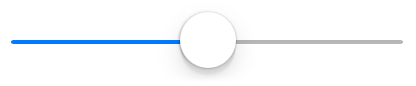
Slider.action¶A function or method that gets called when slider’s value is changed by the user. By default, the action only gets called when the dragging gesture has ended. You can change this by setting continuous to True.
The function must take a single sender parameter (excluding self if it’s a bound method).
Slider.continuous¶When set to True, the slider’s action is called while the user is still dragging the knob, otherwise, the action will only be sent when the dragging gesture has ended. The default is False.
Slider.value¶The slider’s current value (between 0.0 and 1.0).

Switch.action¶A function or method that gets called when switch’s value is changed by the user.
The function must take a single sender parameter (excluding self if it’s a bound method).
Switch.enabled¶When set to False, the switch is grayed out and its value cannot be changed by the user.
Switch.value¶True when the switch is turned on, False otherwise.
ui.TableView¶A table view displays a list of items in a single column. TableView is a subclass of ScrollView, so all scrolling-related methods and attributes are inherited.
Every row in a table view is presented by a TableViewCell. These cells have a default text label, but you can also add custom views to them.
A table view needs a data source to display any cells. The data source is any object that implements the methods described in TableView.data_source (not all of them are required).
To make things easier, the ui module includes a ListDataSource class that implements all the requirements for displaying a simple list of strings that can be edited with the standard table view interface. ListDataSource automatically reloads its table view when its ListDataSource.items list is modified. It also updates its items when the user performs a swipe-to-delete gesture or reorders rows in editing mode.
Table views that are created in the UI designer automatically set their data_source and delegate to a ListDataSource that is created for you, and a static list of items can be configured without writing any code.
TableView.allows_multiple_selection¶A boolean value that determines whether users can select more than one row outside of editing mode.
TableView.allows_multiple_selection_during_editing¶A boolean value that controls whether users can select more than one cell simultaneously in editing mode. When set to True, checkmarks appear next to selected rows in editing mode.
TableView.allows_selection¶TableView.allows_selection_during_editing¶A boolean value that determines whether users can select cells while the table view is in editing mode.
TableView.data_source¶The table view’s data source, which can be any object that implements the methods defined below. All of the methods are optional, e.g. if your data source doesn’t implement editing, you can simply leave out the editing-related methods.
If your needs are simple, consider using a ListDataSource, which already implements all of the requirements for displaying a simple list of strings in a single section.
class MyTableViewDataSource (object):
    def tableview_number_of_sections(self, tableview):
        # Return the number of sections (defaults to 1)
        return 1

    def tableview_number_of_rows(self, tableview, section):
        # Return the number of rows in the section
        return 0

    def tableview_cell_for_row(self, tableview, section, row):
        # Create and return a cell for the given section/row
        cell = ui.TableViewCell()
        cell.text_label.text = 'Foo Bar'
        return cell

    def tableview_title_for_header(self, tableview, section):
        # Return a title for the given section.
        # If this is not implemented, no section headers will be shown.
        return 'Some Section'

    def tableview_can_delete(self, tableview, section, row):
        # Return True if the user should be able to delete the given row.
        return True

    def tableview_can_move(self, tableview, section, row):
        # Return True if a reordering control should be shown for the given row (in editing mode).
        return True

    def tableview_delete(self, tableview, section, row):
        # Called when the user confirms deletion of the given row.
        pass

    def tableview_move_row(self, tableview, from_section, from_row, to_section, to_row):
        # Called when the user moves a row with the reordering control (in editing mode).
        pass
TableView.delegate¶The table view’s delegate can be any object that implements the methods defined below. The delegate does not need to implement all of the methods, the table view will use a default behavior when a method isn’t implemented.
Please see About Actions and Delegates for more information about the concept of delegates in general.
class MyTableViewDelegate (object):
    def tableview_did_select(self, tableview, section, row):
        # Called when a row was selected.
        pass

    def tableview_did_deselect(self, tableview, section, row):
        # Called when a row was de-selected (in multiple selection mode).
        pass

    def tableview_title_for_delete_button(self, tableview, section, row):
        # Return the title for the 'swipe-to-***' button.
        return 'Delete'
TableView.editing¶A boolean value that determines whether the table view is in editing mode.
Depending on the data_source, a table view might display deletion controls on the left side of each cell and a reordering control on the right side.
By default, normal selection is disabled in editing mode, you can change this by setting allows_selection_during_editing to True.
TableView.row_height¶The height of the table view’s cells.
TableView.selected_row¶The section and row of the first selected row (as a 2-tuple).
TableView.selected_rows¶A sequence of selected rows, each as a 2-tuple (section, row).
TableView.separator_color¶The color of cell separator lines.
When setting this attribute, you can pass a string (CSS color name or hex, e.g. 'red' or '#ff0000'), a tuple (e.g. (1.0, 0.0, 0.0, 0.5) for half-transparent red), or a number (e.g. 0.5 for 50% gray). Internally, all colors are converted to RGBA tuples, so when you access the color later, you’ll get (1.0, 1.0, 1.0, 1.0), no matter if you set the color to 'white', '#ffffff' or just 1.0.
TableView.reload()¶TableView.reload_data()¶Reloads the table view’s data (by calling the relevant methods of the data_source).
TableView.set_editing(editing, animated)¶Same as setting the editing attribute, but with an option to animate the transition.
TableView.delete_rows(rows)¶Delete the given sequence of row indexes from the table view with a default animation. If you don’t want animation, just modify your data source and reload() the table view.
The data source is expected to return the updated number of rows from the tableview_number_of_rows method. If the number of rows is inconsistent, an exception will be thrown.
TableView.insert_rows(rows)¶Insert the given sequence of row indexes into the table view with a default animation. If you don’t want animation, just modify your data source and reload() the table view.
The data source is expected to return the updated number of rows from the tableview_number_of_rows method. If the number of rows is inconsistent, an exception will be thrown.
Each row index in the sequence can be a 2-tuple of numbers (section, row) or a single number. If a single number is given, the first section is assumed.
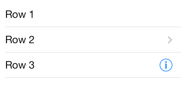
ui.TableViewCell(style='default')¶TableViewCell objects provide the visible content for a TableView. You typically create cells in the data_source method tableview_cell_for_row.
The style argument can be one of 'default', 'subtitle', 'value1', or 'value2'. In the default style, a cell has only one built-in text label (text_label), the other styles also have a secondary label (detail_text_label).
TableViewCell.accessory_type¶Determines what’s shown on the right side of the cell. This can be one of the following:
'none' – No accessory'disclosure_indicator' – A “chevron”-type arrowdetail_disclosure_button – An “info” button and a chevron-type arrow (implement tableview_accessory_button_tapped in the table view’s delegate to handle taps on the button)'detail_button – An info button (implement tableview_accessory_button_tapped in the table view’s delegate to handle taps on the button)TableViewCell.content_view¶(readonly) The cell’s content view, which is resized automatically when the cell enters editing mode. If you want to add custom views to the cell, it’s recommended that you add them to the content view, instead of the cell itself.
TableViewCell.detail_text_label¶(readonly) The built-in detail text label, which is used for certain cell styles (in the default style, this will be None)
TableViewCell.image_view¶(readonly) The built-in image view of the cell.
TableViewCell.selectable¶Determines whether the cell shows a selection highlight.
TableViewCell.selected_background_view¶The view that is used for displaying the highlighted/selected state of a cell. It is resized automatically to fill the entire background.
TableViewCell.text_label¶(readonly) The cell’s main text label. The label is created automatically by the cell, and you can’t replace it, but you can customize its font, text color, etc. like any other label.
TextField.action¶A function or method that gets called when text field has finished editing.
The function must take a single sender parameter (excluding self if it’s a bound method).
TextField.alignment¶The text field’s text alignment (one of the Text Alignment constants defined below).
TextField.autocapitalization_type¶The text field’s auto-capitalization behavior as one of the Text Auto-Capitalization constants defined below.
TextField.autocorrection_type¶The text field’s auto-correction behavior, can be None (default behavior, depends on user’s system settings), True (auto-correction enabled), or False (auto-correction disabled).
TextField.bordered¶When set to True, a default (rounded rectangle) border is shown behind the text field.
Determines when/if the clear button is shown on the right side of the text field.
'never' – The clear button is not shown (the default)'always' – The clear button is always visible'while_editing' – The clear button is only shown when the text is being edited'unless_editing' – The clear button is only shown when the text is not being editedTextField.delegate¶A helper object that can observe various editing-related events by implementing the following methods (all methods are optional, so a delegate can implement only some of them).
Please see About Actions and Delegates for more information about the concept of delegates in general.
class MyTextFieldDelegate (object):
    def textfield_should_begin_editing(self, textfield):
        return True
    def textfield_did_begin_editing(self, textfield):
        pass
    def textfield_did_end_editing(self, textfield):
        pass
    def textfield_should_return(self, textfield):
        textfield.end_editing()
        return True
    def textfield_should_change(self, textfield, range, replacement):
        return True
    def textfield_did_change(self, textfield):
        pass
TextField.enabled¶When set to False, the text field is grayed out and not editable.
TextField.font¶The text field’s font as a tuple (font_name, font_size). In addition to regular font names, you can also use '<system>' or '<system-bold>' to get the default regular or bold font.
TextField.keyboard_type¶The text field’s keyboard type (one of Keyboard Type constants defined below).
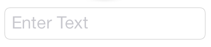
TextField.placeholder¶The grayed-out placeholder text that is shown when the text field is empty.
TextField.secure¶Set to True to turn the text field into a password field (with masked input).
TextField.spellchecking_type¶The text field’s spellchecking behavior, can be None (default behavior, depends on user’s system settings), True (spellchecking enabled), or False (spellchecking disabled).
TextField.text¶The text field’s text.
TextField.text_color¶The text field’s text color.
When setting this attribute, you can pass a string (CSS color name or hex, e.g. 'red' or '#ff0000'), a tuple (e.g. (1.0, 0.0, 0.0, 0.5) for half-transparent red), or a number (e.g. 0.5 for 50% gray). Internally, all colors are converted to RGBA tuples, so when you access the color later, you’ll get (1.0, 1.0, 1.0, 1.0), no matter if you set the color to 'white', '#ffffff' or just 1.0.
ui.TextView¶A TextView implements a scrollable, multi-line text region. Text views are editable by default, but they can also present static text that cannot be changed by the user.
TextView.alignment¶TextView.autocapitalization_type¶The text view’s auto-capitalization behavior as one of the Text Auto-Capitalization constants defined below.
TextView.autocorrection_type¶The text view’s auto-correction behavior, can be None (default behavior, depends on user’s system settings), True (auto-correction enabled), or False (auto-correction disabled).
TextView.auto_content_inset¶When set to True (the default), the text view automatically sets the content inset when the onscreen keyboard frame changes, so that content that is covered by the keyboard remains accessible.
TextView.delegate¶The text view’s delegate can be any object that implements (some of) the methods defined below. You can use a delegate to be notified of editing events and to customize the text view’s behavior in certain situations.
Please see About Actions and Delegates for more information about the concept of delegates in general.
Delegate methods:
class MyTextViewDelegate (object):
    def textview_should_begin_editing(self, textview):
        return True
    def textview_did_begin_editing(self, textview):
        pass
    def textview_did_end_editing(self, textview):
        pass
    def textview_should_change(self, textview, range, replacement):
        return True
    def textview_did_change(self, textview):
        pass
    def textview_did_change_selection(self, textview):
        pass
TextView.editable¶When set to False, the user cannot edit the text view’s contents.
TextView.font¶The text view’s font as a tuple (font_name, font_size). In addition to regular font names, you can also use '<system>' or '<system-bold>' to get the default regular or bold font.
TextView.keyboard_type¶The text view’s keyboard type (one of Keyboard Type constants defined below).
TextView.selectable¶When set to False, the user cannot select the text view’s contents.
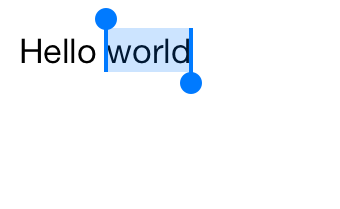
TextView.selected_range¶A 2-tuple (start, end) that represents the current user selection. When setting this, a ValueError is thrown for ranges that are out of bounds.
TextView.spellchecking_type¶The text view’s spellchecking behavior, can be None (default behavior, depends on user’s system settings), True (spellchecking enabled), or False (spellchecking disabled).
TextView.text¶The text view’s text.
TextView.text_color¶The text view’s text color.
When setting this attribute, you can pass a string (CSS color name or hex, e.g. 'red' or '#ff0000'), a tuple (e.g. (1.0, 0.0, 0.0, 0.5) for half-transparent red), or a number (e.g. 0.5 for 50% gray). Internally, all colors are converted to RGBA tuples, so when you access the color later, you’ll get (1.0, 1.0, 1.0, 1.0), no matter if you set the color to 'white', '#ffffff' or just 1.0.
TextView.begin_editing()¶Give keyboard focus to this text view to begin editing.
TextView.end_editing()¶End editing this text view, i.e. dismiss the keyboard.
TextView.replace_range(range, text)¶Replace a range within the text view’s text. The range parameter must be a (start, end) tuple. To insert text, you can use an zero-length range.
WebView.delegate¶A web view’s delegate can be any object that implements (some of) the methods defined below. You can use a delegate to be notified of certain events relating to loading a web page (e.g. when the page has finished loading). You can also use a delegate to customize the web view’s behavior when a link is tapped (e.g. to only allow certain types of navigation or to handle custom URL schemes in Python code).
Please see About Actions and Delegates for more information about the concept of delegates in general.
Delegate methods:
class MyWebViewDelegate (object):
    def webview_should_start_load(self, webview, url, nav_type):
        return True
    def webview_did_start_load(self, webview):
        pass
    def webview_did_finish_load(self, webview):
        pass
    def webview_did_fail_load(self, webview, error_code, error_msg):
        pass
WebView.scales_page_to_fit¶If True, the webpage is scaled to fit and the user can zoom in and out. If False, user zooming is disabled. The default value is False.
WebView.load_url(url)¶Load a given URL. The loading process is asynchronous, i.e. this method will return before the web view has finished loading.
WebView.load_html(html)¶Render the given HTML string.
WebView.go_back()¶Go back in the web view’s page history. If the history is empty, this method does nothing.
WebView.go_forward()¶Go forward in the web view’s page history. If the web view is at the end of its history stack, this method does nothing.
WebView.reload()¶Reload the current page.
WebView.stop()¶Stop loading the current request.
WebView.eval_js(js)¶WebView.evaluate_javascript(js)¶Evaluate a snippet of JavaScript in the context of the current page and return the result as a string.
ui.DatePicker¶A DatePicker shows a user-selectable date and/or time. It can also be configured to show a countdown.
DatePicker.action¶A function or method that gets called when the picker’s date value changes.
The function must take a single sender parameter (excluding self if it’s a bound method).
DatePicker.countdown_duration¶The current countdown value of the date picker in seconds (only has an effect if mode is DATE_PICKER_MODE_COUNTDOWN).
DatePicker.date¶The date that the picker currently shows (as a datetime.datetime object)
DatePicker.enabled¶When set to False the date picker is grayed out and doesn’t handle touch events.
DatePicker.mode¶The date picker’s current mode (one of the `Date Picker Mode`_ constants defined below).
An
ActivityIndicatoris a view that indicates some kind of indeterminate progress, for example a network request. It is displayed as a circular “spinner”. Activity indicators have a fixed size, depending on the their style.Note: The
ActivityIndicatorclass is currently not available in the visual UI editor.
ActivityIndicator.start()¶Start animating the indicator.
ActivityIndicator.stop()¶Stop animating the indicator.
ActivityIndicator.style¶One of the integer constants defined under ActivityIndicator Styles (gray, white, or white large). The style of an activity indicator also determines its size.
ActivityIndicator.hides_when_stopped¶A boolean flag that determines whether the activity indicator is automatically hidden when it is not animating.
ui.Image¶An Image object represents a bitmap image that can be used to decorate various controls (e.g. Button). It can also be the result of custom drawing operations via an ImageContext.
Image.from_data(image_data[, scale])¶Create an image from binary data in the image_data string. The data should be in one of the common image formats (png, jpeg...).
The optional scale argument specifies how the image is displayed on high-resolution (“retina”) screens. 2.0 is a typical value for most iOS devices. 1.0 is the default.
Image.scale¶(readonly) The scale factor of the image, this will typically be 2.0 for “retina” images, and 1.0 otherwise.
Image.clip_to_mask(x, y, width, height)¶Use the image as a mask for following drawing operations.
Image.draw([x, y, width, height])¶Draw the image into a rectangle in the current drawing context. The rectangle parameters are optional, when left out, the image will be drawn with its natural size.
Image.draw_as_pattern(x, y, width, height)¶Fill a given rectangle with the image used as a repeating pattern. If you want to fill arbitrary shapes with a pattern, you can use Path.add_clip().
Image.resizable_image(top, left, bottom, right)¶Create a 9-patch image with the given edges. This technique is most commonly used to create scalable backgrounds for buttons etc.
Image.show()¶Show the image in the console.
Image.to_png()¶Return a byte string of the image in PNG format. This can be saved to a file for example.
ui.ImageContext(width, height, scale=0)¶An ImageContext provides a context manager for drawing custom images. See Drawing Contexts for more details.
Example:
import ui
with ui.ImageContext(100, 100) as ctx:
    oval = ui.Path.oval(0, 0, 100, 100)
    ui.set_color('red')
    oval.fill()
    img = ctx.get_image()
    img.show()
ui.Path¶Path objects represent lines and curves and shapes. They can be used for various drawing operations (filling, stroking, clipping) in images and views.
Path.bounds¶(readonly) The path’s bounding rectangle (enclosing all points).
Path.eo_fill_rule¶If True, the path is filled using the even-odd rule. If False (the default), it is filled using the non-zero rule. Both rules are algorithms to determine which areas of a path to fill with the current fill color. A ray is drawn from a point inside a given region to a point anywhere outside the path’s bounds. The total number of crossed path lines (including implicit path lines) and the direction of each path line are then interpreted as follows:
Path.line_cap_style¶The shape of the path’s end points when stroked. The value should be one of the Line Cap Style constants listed below.
Path.line_join_style¶The shape of the joints between connected segments of a stroked path. The value should be one of the Line Join Style constants listed below.
Path.line_width¶The width of the path’s line when stroked, in points.
Path.add_arc(center_x, center_y, radius, start_angle, end_angle[, clockwise=True])¶Append an arc to the path.
Path.add_clip()¶Modify the visible drawing area of the current graphics context. After calling it, subsequent drawing operations result in rendered content only if they occur within the fill area of the path.
Path.add_curve(end_x, end_y, cp1_x, cp1_y, cp2_x, cp2_y)¶Append a cubic Bézier curve to the path.
Path.add_quad_curve(end_x, end_y, cp_x, cp_y)¶Append a quadratic Bézier curve to the path.
Path.append_path(other_path)¶Append the contents of the specified path to this path.
Path.close()¶Close the current subpath by creating a line segment between the first and last points in the subpath.
Path.fill()¶Paint the region enclosed by the path using the current drawing properties.
Path.hit_test(x, y)¶Check whether the specified point is within the path’s bounds.
Path.line_to(x, y)¶Append a straight line segment to the specified point.
Path.move_to(x, y)¶Move the path’s current point to the specified location.
Path.set_line_dash(sequence[, phase])¶Set the line-stroking pattern for the path. sequence is a list of numbers that contain the lengths of the line segments and gaps in the pattern. It starts with the first line segment length. phase is the offset at which to start drawing the pattern. For example, a phase value of 6 for the pattern [5, 2, 3, 2] would cause drawing to begin in the middle of the first gap.
Path.stroke()¶Draw a line along the path using the current drawing properties.
ui.Touch¶Touch objects represent a finger on the screen. You typically don’t create touch objects directly, but you can inspect the objects that are passed to a custom View‘s touch handling methods.
Touch.location¶(readonly) The location of the touch (x, y as a 2-tuple) in the coordinate system of the View that the touch belongs to.
Touch.phase¶(readonly) The current phase of the touch, can be 'began', 'ended', 'moved', 'stationary' or 'cancelled'.
Touch.timestamp¶(readonly) The timestamp of the touch (in milliseconds since 1970).
Touch.touch_id¶(readonly) A unique identifier (integer) for the touch that can be used to track touches across different events.
ui.Transform¶A Transform object represents an affine transformation matrix. It is most commonly used with the View.transform attribute (which can also be animated).
Transform.rotation(rad)¶Create a rotation transform with the given angle (in radians).
Transform.scale(sx, sy)¶Create a scale transform with the given horizontal and vertical scale factors.
Transform.translation(tx, ty)¶Create a translation transform with the given horizontal and vertical values.
ui.GState¶The GState class represents the global state of the current drawing context, i.e. the current fill color, transformation, clipping, etc. It is typically used as a context manager for performing drawing operations that alter the global state (e.g. clipping), and restoring it to the previous state afterwards.
This example shows how rotated text is drawn with a Transform and the drawing state is reset back to normal afterwards:
import ui

with ui.ImageContext(100, 100) as ctx:
    with ui.GState():
        ui.concat_ctm(ui.Transform.rotation(0.78))
        ui.draw_string('    Rotated text')
    ui.draw_string('Not rotated')
    ctx.get_image().show()
ui.ListDataSource(items=None)¶ListDataSource implements TableView datasource to show a simple list of strings that can be edited with the standard table view interface. ListDataSource automatically reloads its table view when its ListDataSource.items list is modified. It also updates its items when the user performs a swipe-to-delete gesture or reorders rows in editing mode.
The ListDataSource can also be set as the TableView‘s delegate to handle selection actions.
ListDataSource.accessory_action¶Called when an info button is tapped in one of the list’s cells. The sender argument will be the ListDataSource object.
ListDataSource.action¶Called when the TableView‘s selection changes (and the datasource is set as the table view’s delegate). The sender argument will be the ListDataSource object. You can get the affected row by checking the selected_row attribute.
ListDataSource.delete_enabled¶A boolean flag that determines whether rows can be deleted by the user.
ListDataSource.edit_action¶Called when rows are deleted or rearranged. The sender argument of the action will be the ListDataSource object. The items attribute is already updated when the action is called.
ListDataSource.font¶The font for displaying each row in the TableView. This is a 2-tuple of font name and size, e.g. ('<system>', 20).
ListDataSource.highlight_color¶The highlight/selection color that the data source uses for the background of the cells that it’s creating.
When setting this attribute, you can pass a string (CSS color name or hex, e.g. 'red' or '#ff0000'), a tuple (e.g. (1.0, 0.0, 0.0, 0.5) for half-transparent red), or a number (e.g. 0.5 for 50% gray). Internally, all colors are converted to RGBA tuples, so when you access the color later, you’ll get (1.0, 1.0, 1.0, 1.0), no matter if you set the color to 'white', '#ffffff' or just 1.0.
ListDataSource.items¶A sequence of items that are shown in the TableView. This can either be a list of strings or a list of dictionaries that give more control over how the items are presented. The item dictionaries can contain the following keys:
Image object or a name that can be used with Image.named().ListDataSource.move_enabled¶A boolean flag that determines whether rows can be reordered by the user.
ListDataSource.number_of_lines¶The number of lines that are used for the list item titles (equivalent to Label.number_of_lines).
ListDataSource.selected_row¶The index of the currently selected row (-1 if no row is selected).
ListDataSource.tapped_accessory_row¶The index of the row whose accessory button was tapped last. This is mostly useful for implementing an accessory_action.
ListDataSource.text_color¶The text color that the data source uses for configuring cells.
When setting this attribute, you can pass a string (CSS color name or hex, e.g. 'red' or '#ff0000'), a tuple (e.g. (1.0, 0.0, 0.0, 0.5) for half-transparent red), or a number (e.g. 0.5 for 50% gray). Internally, all colors are converted to RGBA tuples, so when you access the color later, you’ll get (1.0, 1.0, 1.0, 1.0), no matter if you set the color to 'white', '#ffffff' or just 1.0.
ui.animate(animation, duration=0.25, delay=0.0, completion=None)¶Animate changes in various View attributes. animation is a callable/function that should change the attributes that you want to animate. See the View Animation section for an example.
ui.convert_point(point=(0, 0), from_view=None, to_view=None)¶Convert a point from one view’s coordinate system to another. If from_view or to_view is None, the screen coordinate system is used.
ui.convert_rect(rect=(0, 0, 0, 0), from_view=None, to_view=None)¶Convert a rectangle from one view’s coordinate system to another. If from_view or to_view is None, the screen coordinate system is used.
ui.delay(func, seconds)¶Call a function after a given delay.
See also: cancel_delays()
ui.in_background(fn)¶Call a function on the main interpreter thread. This is useful to perform long-running tasks from an action or delegate callback without blocking the UI. It can also be used for functions that don’t support being called from the main UI thread (e.g. console.alert()).
This is typically used as a function decorator:
import ui
import console

@ui.in_background
def button_tapped(sender):
    alert_result = console.alert('Title', 'Message', 'Button 1', 'Button 2')
    sender.title = 'Button ' + str(alert_result)

button = ui.Button(title='Tap me!')
button.action = button_tapped
button.present('sheet')
ui.load_view(pyui_path=None, bindings=None)¶Load a view from a .pyui file that was created with the bundled UI design tool. If the path is omitted, the filename of the current script with a .pyui extension is used.
In Editorial, the path can almost always be omitted (it’ll load the UI that’s associated with the current workflow action automatically).
If the pyui file contains Python identifiers (e.g. action names or custom attributes), they are evaluated in the environment of the caller. This behavior can be overridden with the bindings parameter (a mapping from names to objects).
ui.load_view_str(json_string, bindings=None)¶Load a view from a JSON string (the contents of a .pyui file). This is used internally by load_view().
ui.dump_view(view)¶Serialize a view as a JSON string. The return value can be saved as a .pyui file or it can be passed to load_view_str() to reconstruct the view later.
Custom view attributes are not supported, and images in image views and buttons are only saved if they were loaded from a built-in image (i.e. using ui.Image.named()). Overall, the limitations of this function are similar to those of the visual UI editor.
ui.get_screen_size()¶Return the size of the main screen as a (width, height) tuple (in points).
ui.get_window_size()¶Return the size of the app’s main window. While this is usually the same as get_screen_size(), this function returns a different size when the app is running in split-screen mode on an iPad.
ui.get_ui_style()¶Return the current UI style on iOS 13+ ('dark' or 'light').
ui.parse_color(color)¶Convert a color from various formats to a (r, g, b, a) tuple. Most commonly, color will be a hex string (e.g. ‘#ff0000’) or a CSS color name (e.g. ‘red’).
ui.fill_rect(x, y, width, height)¶Fill the given rect with the current color (set via set_color()).
ui.set_blend_mode(mode)¶Set the blend mode for following drawing operations. mode can be one of the Blend Mode constants listed below.
ui.set_color(color)¶Set the current drawing color. This has an effect on following drawing operations, e.g. fill_rect() or Path.fill().
You can pass a string (CSS color name or hex, e.g. 'red' or '#ff0000'), a tuple (e.g. (1.0, 0.0, 0.0, 0.5) for half-transparent red), or a number (e.g. 0.5 for 50% gray).
ui.set_shadow(color, offset_x, offset_y, blur_radius)¶Configure a drop shadow for following drawing operations. The current shadow is part of the global state of a drawing context, if you want to set a shadow only temporarily, use a GState context manager to save and restore the graphics state.
ui.concat_ctm(transform)¶Transform the user coordinate system in a drawing context using a Transform.
If you want to modify the coordinate system only temporarily, use a GState context manager to save and restore the graphics state.
ui.measure_string(string, max_width=0, font=('<system>', 12), alignment=ui.ALIGN_LEFT, line_break_mode=ui.LB_WORD_WRAP)¶Return the dimensions (width, height) of a string if it was drawn with draw_string().
When the max_width parameter is set to zero (the default), the width of the drawing is not constrained (i.e. would be drawn on a single line if there are no manual line breaks).
ui.draw_string(string, rect=(0, 0, 0, 0), font=('<system>', 12), color='black', alignment=ui.ALIGN_LEFT, line_break_mode=ui.LB_WORD_WRAP)¶Draw a string into the given rectangle. If the rectangle’s size is zero, the drawing will use its origin as the drawing position, but the size will be unconstrained.
ui.convert_point(point=(0, 0), from_view=None, to_view=None)Convert a coordinate between two views. If one of the views is None, the conversion happens between the other view and the base screen coordinates.
The following blend modes can be used with set_blend_mode(). They are defined as integer constants. The blend mode descriptions below are quoted from Apple’s Core Graphics documentation.
The blend mode constants represent the Porter-Duff blend modes. The symbols in the equations for these blend modes are:
R is the premultiplied resultS is the source color, and includes alphaD is the destination color, and includes alphaRa, Sa, and Da are the alpha components of R, S, and Dui.BLEND_NORMAL¶Paints the source image samples over the background image samples.
ui.BLEND_MULTIPLY¶Multiplies the source image samples with the background image samples. This results in colors that are at least as dark as either of the two contributing sample colors.
ui.BLEND_SCREEN¶Multiplies the inverse of the source image samples with the inverse of the background image samples. This results in colors that are at least as light as either of the two contributing sample colors.
ui.BLEND_OVERLAY¶Either multiplies or screens the source image samples with the background image samples, depending on the background color. The result is to overlay the existing image samples while preserving the highlights and shadows of the background. The background color mixes with the source image to reflect the lightness or darkness of the background.
ui.BLEND_DARKEN¶Creates the composite image samples by choosing the darker samples (either from the source image or the background). The result is that the background image samples are replaced by any source image samples that are darker. Otherwise, the background image samples are left unchanged.
ui.BLEND_LIGHTEN¶Creates the composite image samples by choosing the lighter samples (either from the source image or the background). The result is that the background image samples are replaced by any source image samples that are lighter. Otherwise, the background image samples are left unchanged.
ui.BLEND_COLOR_DODGE¶Brightens the background image samples to reflect the source image samples. Source image sample values that specify black do not produce a change.
ui.BLEND_COLOR_BURN¶Darkens the background image samples to reflect the source image samples. Source image sample values that specify white do not produce a change.
ui.BLEND_SOFT_LIGHT¶Either darkens or lightens colors, depending on the source image sample color. If the source image sample color is lighter than 50% gray, the background is lightened, similar to dodging. If the source image sample color is darker than 50% gray, the background is darkened, similar to burning. If the source image sample color is equal to 50% gray, the background is not changed. Image samples that are equal to pure black or pure white produce darker or lighter areas, but do not result in pure black or white. The overall effect is similar to what you’d achieve by shining a diffuse spotlight on the source image. Use this to add highlights to a scene.
ui.BLEND_HARD_LIGHT¶Either multiplies or screens colors, depending on the source image sample color. If the source image sample color is lighter than 50% gray, the background is lightened, similar to screening. If the source image sample color is darker than 50% gray, the background is darkened, similar to multiplying. If the source image sample color is equal to 50% gray, the source image is not changed. Image samples that are equal to pure black or pure white result in pure black or white. The overall effect is similar to what you’d achieve by shining a harsh spotlight on the source image. Use this to add highlights to a scene.
ui.BLEND_DIFFERENCE¶Subtracts either the source image sample color from the background image sample color, or the reverse, depending on which sample has the greater brightness value. Source image sample values that are black produce no change; white inverts the background color values.
ui.BLEND_EXCLUSION¶Produces an effect similar to that produced by kCGBlendModeDifference, but with lower contrast. Source image sample values that are black don’t produce a change; white inverts the background color values.
ui.BLEND_HUE¶Uses the luminance and saturation values of the background with the hue of the source image.
ui.BLEND_SATURATION¶Uses the luminance and hue values of the background with the saturation of the source image. Areas of the background that have no saturation (that is, pure gray areas) don’t produce a change.
ui.BLEND_COLOR¶Uses the luminance values of the background with the hue and saturation values of the source image. This mode preserves the gray levels in the image. You can use this mode to color monochrome images or to tint color images.
ui.BLEND_LUMINOSITY¶Uses the hue and saturation of the background with the luminance of the source image. This mode creates an effect that is inverse to the effect created by BLEND_COLOR.
ui.BLEND_CLEAR¶R = 0
ui.BLEND_COPY¶R = S
ui.BLEND_SOURCE_IN¶R = S*Da
ui.BLEND_SOURCE_OUT¶R = S*(1 - Da)
ui.BLEND_SOURCE_ATOP¶R = S*Da + D*(1 - Sa)
ui.BLEND_DESTINATION_OVER¶R = S*(1 - Da) + D
ui.BLEND_DESTINATION_IN¶R = D*Sa
ui.BLEND_DESTINATION_OUT¶R = D*(1 - Sa)
ui.BLEND_DESTINATION_ATOP¶R = S*(1 - Da) + D*Sa
ui.BLEND_XOR¶R = S*(1 - Da) + D*(1 - Sa). This XOR mode is only nominally related to the classical bitmap XOR operation, which is not supported by Quartz 2D.
ui.BLEND_PLUS_DARKER¶R = MAX(0, 1 - ((1 - D) + (1 - S)))
ui.BLEND_PLUS_LIGHTER¶R = MIN(1, S + D)
The following constants are used for the Path.line_cap_style attribute.
ui.LINE_CAP_BUTT
ui.LINE_CAP_ROUND
ui.LINE_CAP_SQUARE
The following constants are used for the Path.line_join_style attribute.
ui.LINE_JOIN_BEVEL
ui.LINE_JOIN_MITER
ui.LINE_JOIN_ROUND
The following constants are used for TextView.keyboard_type and TextField.keyboard_type.
ui.KEYBOARD_ASCII¶ui.KEYBOARD_DECIMAL_PAD¶ui.KEYBOARD_DEFAULT¶ui.KEYBOARD_EMAIL¶ui.KEYBOARD_NAME_PHONE_PAD¶ui.KEYBOARD_NUMBERS¶ui.KEYBOARD_NUMBER_PAD¶ui.KEYBOARD_PHONE_PAD¶ui.KEYBOARD_TWITTER¶ui.KEYBOARD_URL¶ui.KEYBOARD_WEB_SEARCH¶The following constants are used for the View.content_mode attribute (in particular for ImageView).
ui.CONTENT_SCALE_TO_FILL¶Scale the content to fit the size of itself by changing the aspect ratio of the content if necessary.
ui.CONTENT_SCALE_ASPECT_FIT¶Scale the content to fit the size of the view by maintaining the aspect ratio. Any remaining area of the view’s bounds is transparent.
ui.CONTENT_SCALE_ASPECT_FILL¶Scale the content to fill the size of the view. Some portion of the content may be clipped to fill the view’s bounds.
ui.CONTENT_REDRAW¶Redisplay the view when the bounds change by invoking the View.set_needs_display() method.
ui.CONTENT_CENTER¶Center the content in the view’s bounds, keeping the proportions the same.
ui.CONTENT_TOP¶Center the content aligned at the top in the view’s bounds.
ui.CONTENT_BOTTOM¶Center the content aligned at the bottom in the view’s bounds.
ui.CONTENT_LEFT¶Align the content on the left of the view.
ui.CONTENT_RIGHT¶Align the content on the right of the view.
ui.CONTENT_TOP_LEFT¶Align the content in the top-left corner of the view.
ui.CONTENT_TOP_RIGHT¶Align the content in the top-right corner of the view.
ui.CONTENT_BOTTOM_LEFT¶Align the content in the bottom-left corner of the view.
ui.CONTENT_BOTTOM_RIGHT¶Align the content in the bottom-right corner of the view.
ui.LB_WORD_WRAP¶Wrapping occurs at word boundaries, unless the word itself doesn’t fit on a single line.
ui.LB_CHAR_WRAP¶Wrapping occurs before the first character that doesn’t fit.
ui.LB_CLIP¶Lines are simply not drawn past the edge of the text container.
ui.LB_TRUNCATE_HEAD¶The line is displayed so that the end fits in the container and the missing text at the beginning of the line is indicated by an ellipsis.
ui.LB_TRUNCATE_TAIL¶The line is displayed so that the beginning fits in the container and the missing text at the end of the line is indicated by an ellipsis.
ui.LB_TRUNCATE_MIDDLE¶The line is displayed so that the beginning and end fit in the container and the missing text in the middle is indicated by an ellipsis.
The following constants are used for the alignment attribute (Label, TextField and TextView), and in the draw_string() method.
ui.ALIGN_LEFT¶Align text along the left edge.
ui.ALIGN_CENTER¶Align text equally along both sides of the center line.
ui.ALIGN_RIGHT¶Align text along the right edge.
ui.ALIGN_JUSTIFIED¶Fully justify the text so that the last line in a paragraph is natural aligned.
ui.ALIGN_NATURAL¶Use the default alignment associated with the current script.
ui.AUTOCAPITALIZE_NONE¶ui.AUTOCAPITALIZE_WORDS¶ui.AUTOCAPITALIZE_SENTENCES¶ui.AUTOCAPITALIZE_ALL¶The following constants are used for the DatePicker.mode attribute.
ui.DATE_PICKER_MODE_TIME¶The date picker displays hours, minutes, and (depending on the current locale) an AM/PM designation.
ui.DATE_PICKER_MODE_DATE¶The date picker displays months, days of the month, and years.
ui.DATE_PICKER_MODE_DATE_AND_TIME¶The date picker displays dates (as unified day of the week, month, and day of the month values) plus hours, minutes, and (optionally) an AM/PM designation.
ui.DATE_PICKER_MODE_COUNTDOWN¶The date picker displays hour and minute values.
ui.ACTIVITY_INDICATOR_STYLE_GRAY¶Small gray spinner
ui.ACTIVITY_INDICATOR_STYLE_WHITE¶Small white spinner
ui.ACTIVITY_INDICATOR_STYLE_WHITE_LARGE¶Large white spinner
The following constants are used for the Image.with_rendering_mode() method.
ui.RENDERING_MODE_AUTOMATIC¶The default rendering mode. How the image is rendered depends on the context (e.g. the template mode is used for buttons, the original mode is used for image views)
ui.RENDERING_MODE_ORIGINAL¶Always draw the original image, without treating it as a template.
ui.RENDERING_MODE_TEMPLATE¶Always draw the image as a template image, ignoring its color information. This is used for tinted buttons etc.